How to Start Modern Calligraphy With a Nib, Ink, and Practice Sheets
A guide to Weeks 1-2: Assemble the Kit and Rule Your Guides, Weeks 3-4: Train Pressure, Angle, and the Four Strokes, Weeks 5-6: Write the Lowercase Alphabet in Families, Weeks 7-8: Move to Cards, Envelopes, and Tool Care
Pointed-pen lettering looks mysterious because of one trick: the same nib draws a whisper-thin line and a fat shaded line depending only on how hard you press. Nothing else about the tool changes. That single variable, pressure on the way down and release on the way up, is the entire first month of practice, and it is why a $3 nib teaches faster than a $60 pen that cannot flex. The second thing beginners underestimate is how much of the work is geometry you set up before writing. Guidelines taped one-eighth of an inch apart, a constant slant near 55 degrees, and a fixed ratio between x-height, ascenders, and descenders do most of the job of making handwriting read as lettering. Your hand only has to repeat a few strokes inside a frame you built once. This guide runs eight weeks in four phases: assemble the kit and rule the guides, train pressure and the four building strokes, write the lowercase alphabet in letter families, then put the hand onto cards and envelopes while keeping your ink and nibs alive. Plan on 20 to 30 minutes a day. Two short sessions on more days beats one long session, because pressure control is a motor skill that improves between practice bouts rather than during them.
Modern calligraphy with a pointed nib comes down to three things you control: taped guidelines, a pen held low so both tines touch the paper, and pressure only on the downstroke. Start with a Nikko G or Zebra G nib, an oblique holder if you write right-handed and a straight holder if you write left-handed, plus sumi or walnut ink and smooth bond or marker paper. Rule an 1/8-inch x-height with slant lines at 55 degrees, then drill the entrance stroke, overstroke, understroke, and compound curve for 20 minutes a day for four weeks. Write the lowercase letters in families, then move on to cards and envelopes.
- Time
- 8 weeks; 20-30 minutes a day, five or six days a week
- Cost
- $45-$90 for a full starter kit, then $5-$15 a month in nibs and ink
- Difficulty
- Beginner-friendly but slow: this is fine motor control, not equipment
- Works on
- Practice sheets, place cards, name cards, and envelope addressing
- Not for
- Sign painting, chalk lettering, or broad-edged italic and Gothic hands
- Lasts
- The skill is permanent; a good nib gives 8-20 hours of practice
How do you start Modern Calligraphy With a Nib, Ink, and Practice Sheets?
 Howcompass | How to Start Modern Calligraphy With a Nib, Ink, and Practice Sheets
Weeks 1-2: Assemble the Kit and Rule Your Guides
HowcompassChoose Two Forgiving Nibs and Buy Spares
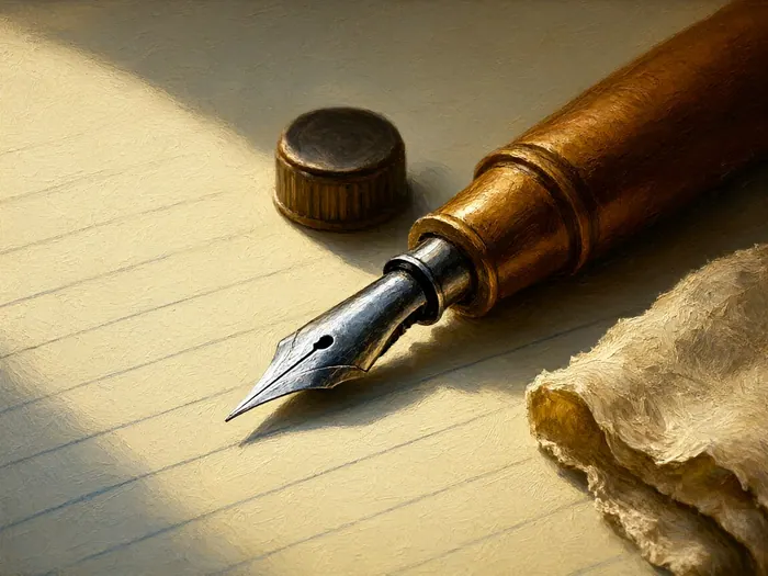
Start with a Nikko G and a Zebra G, the two pointed nibs almost every teacher puts in a beginner's hand. Both are stainless steel, medium-stiff, and tolerant of the uneven pressure you will still be producing, so they last weeks rather than sessions. Expect about $2.50 to $4 each, or roughly $20 to $35 for a ten-pack, and buy the pack instead of singles because one bent tine ends a nib immediately. John Neal Bookseller stocks both models and describes their relative stiffness, which is far more useful to a new writer than a decorative pen set.
 Howcompass
Match the Holder to Your Writing Hand
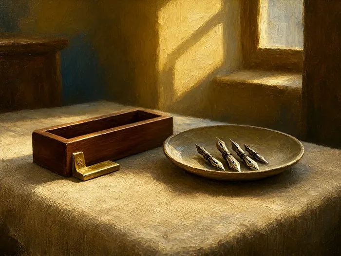
A straight holder is a plain wooden or plastic shaft costing $8 to $20, while an oblique holder adds a small angled flange that the nib screws into. That flange turns the nib face toward your shoulder, so a right-handed writer can reach a steep slant without twisting the wrist. Righties usually find an oblique holder, about $15 to $45, makes shaded strokes click faster, and lefties or shallow-slant writers generally do better on a straight one, though a Pilot parallel pen is a decent no-mess substitute on days when bottled ink is inconvenient. Whichever you pick, grip the shaft 2 to 3 centimeters above the nib so you can watch the tines open.
 Howcompass
Pick One Ink and Learn Its Behavior
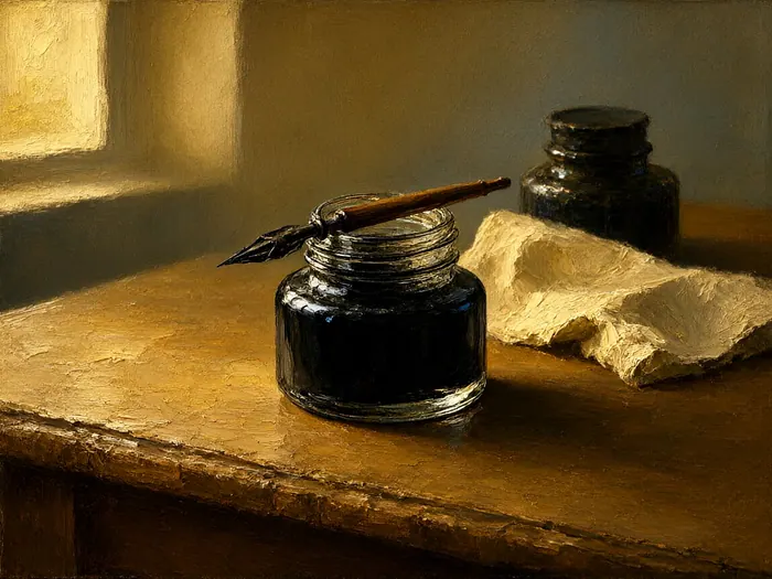
Choose either bottled sumi ink, about $6 to $12, or walnut ink, and use only that one for the first two weeks so you can tell a technique problem from an ink problem. Sumi is a carbon ink that dries to a dense, opaque black hairline and thins nicely with a drop or two of distilled water, while walnut is a translucent dye ink that flows sweetly off the nib but stains everything and feathers on soft paper. Sumi ink sits on the surface rather than soaking in, which is exactly why it keeps hairlines crisp. Pour a few days' supply into a small cap and keep the bottle's threads clean.
 Howcompass
Rule Guidelines at One-Eighth-Inch Increments
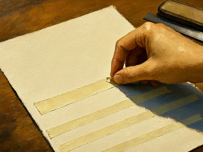
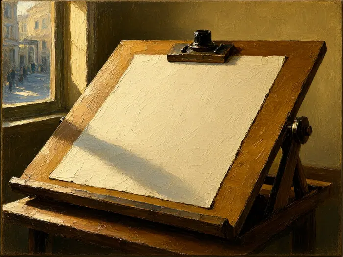
Pointed-pen practice is built on tape, not on an expensive printed pad. Lay two strips of low-tack painter's tape exactly 1/8 inch apart for the x-height band, then add a line 1/4 inch above it for ascenders and 3/16 inch below for descenders, which gives you the 2-to-1-to-1.5 proportion that keeps letters related to one another. Draw slant lines at 55 degrees about 1/4 inch apart on a separate sheet, then work on top of it or tape both guides under tracing paper. Make five or six copies and reuse the same layout all week so your eye learns the widths.
 Howcompass
Set Up a Desk You Can Sit At
You need a firm surface, a chair you can lean forward in, and light reaching from the side opposite your writing hand so the shadow of the nib does not fall across the line you are drawing. A sloped board or drafting table tilted 20 to 30 degrees lets you hold a constant slant without rotating your arm, and a few sheets of scrap under your working page stop the paper bouncing and deadening the nib's spring. This is a lighter version of the setup described in Set Up an Ergonomic Desk and Fix Your Sitting Posture, and it pays off more than any premium nib.
Weeks 3-4: Train Pressure, Angle, and the Four Strokes
 Howcompass
Hold the Pen Low With Both Tines Down
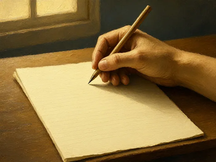
Keep the holder shaft between roughly 30 and 55 degrees above the paper: held too upright the tine tips dig and skip, and held too flat the belly of the nib dumps its reservoir onto the sheet. Both tines should meet the page at the same height, so turn the nib in its flange until the shaded stroke lands cleanly instead of scraping on one edge. Rest your forearm on the desk, keep the wrist loose, and rotate the page so your strokes run across the natural arc of your hand rather than straight ahead. Pause for two minutes every 15 minutes, because a clenched hand cannot feel a spring.
 Howcompass
Press Only on the Downstroke
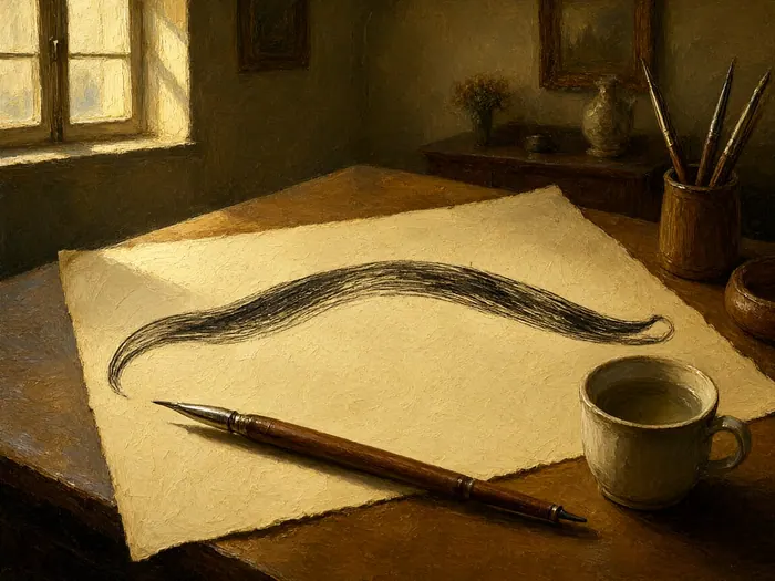
A pointed nib makes a wide line only when its two tines spread apart, and they spread only under pressure, so press on the way down and let go completely on the way up to leave the return travel as a hairline. Fill one page a day with 30 to 40 shaded strokes at 1/8-inch x-height: touch down light, add pressure about a third of the way through the stroke, then ease off before you stop. Keep the speed of each stroke steady rather than rushed. If your upstrokes come out thicker than your downstrokes, you are lifting too slowly and dragging wet ink with the tine tips.
 Howcompass
Load the Nib Without Drowning It
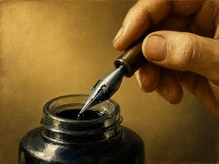
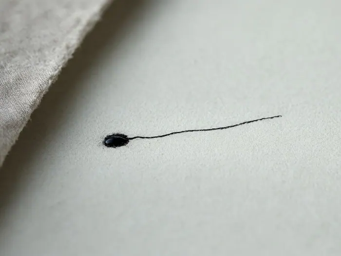
Dip the nib far enough that ink covers the belly and stops about a third of the way up the blade, at or below the small vent hole, then touch the tip once to the rim of the cap. Any more hangs as a bead and drops onto your first letter as a blob, and an overfull nib also hides what the tines are doing, which slows your feedback. Wipe one dry test stroke on a scrap before each word, and re-dip every two or three letters instead of forcing ink out of a nearly empty nib. Beginners almost always dip too deeply, so err on the light side.
 Howcompass
Drill the Four Building Strokes Every Session
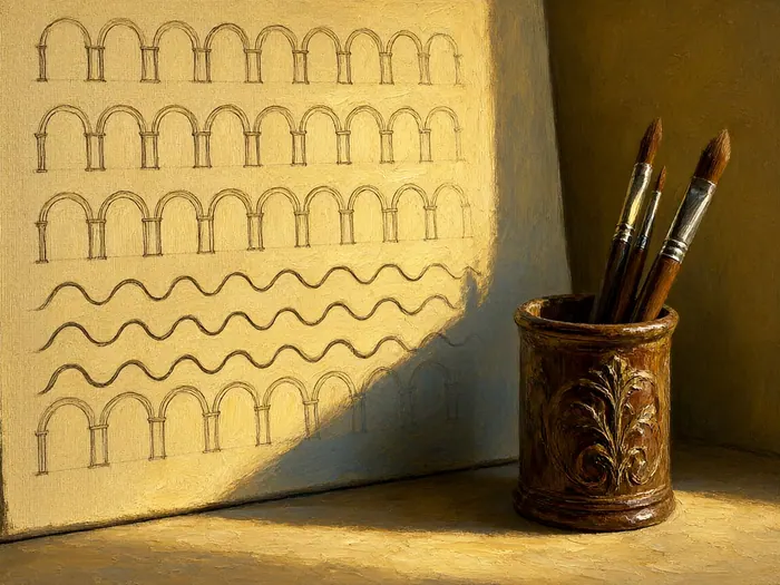
Every letter you will write is assembled from four strokes: the entrance stroke, a light approach in from the left; the overstroke, a hairline arch; the understroke, a hairline dip; and the compound curve, the shaded S-curve that carries most of the weight. Warm up with five minutes on each in that order at 1/8-inch x-height, then spend three minutes on figure-eight loops to keep the hand loose. That 20-minute block is the whole technique, because when a letter looks wrong, one of these four strokes went wrong inside it. The teaching archive at IAMPETH is a good place to watch these strokes executed by working penmen.
 Howcompass
Diagnose Wobble, Blobs, and Scratchy Starts
Three failures account for most early frustration. A wobbling hairline means your hand slowed and fought the paper, so move a little faster, hold less ink, and switch to smoother stock, while a blob at the start of a stroke means an overfull nib or a hard landing, so dip shallower and touch down before you press. A scratchy, spitting start on a brand-new nib usually means leftover manufacturing film: scrub it gently with a dab of toothpaste on an old cloth, rinse, dry, and test on scrap. The shaded-stroke logic behind Copperplate script makes each symptom easy to trace back to its cause.
Weeks 5-6: Write the Lowercase Alphabet in Families
 Howcompass
Learn the Oval Family First
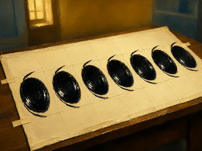
Letters c, a, d, g, o, and q all share a single oval, so build that one shape until it repeats. Draw the bare oval for 10 minutes at 1/8-inch x-height with sides leaning at 55 degrees, then add the entrance stroke in front of it and, for the tall and hanging members of the family, a shaded stem beside it. Check that every oval touches the same two guide lines and leans the same way. When the round letters look like siblings rather than cousins, your hand owns the shape, and most people need four or five 20-minute sessions before that happens consistently.
 Howcompass
Add the Stem and Loop Families
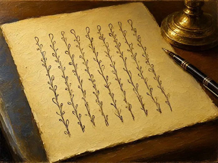
Next come the straight-stem letters i, l, t, u, and j, which reuse the shaded downstroke you already drilled, and the loop letters b, f, h, and k, where a hairline overstroke crosses a shaded stem. Keep ascenders inside the 1/4-inch upper band and descenders inside the 3/16-inch lower band so their proportions match your ovals instead of floating free. Work two letters at a time, 15 controlled rows each, then stop for the day if your lines start to drift, because fatigue installs bad habits faster than practice removes them.
 Howcompass
Close the Alphabet With Arches and Angles
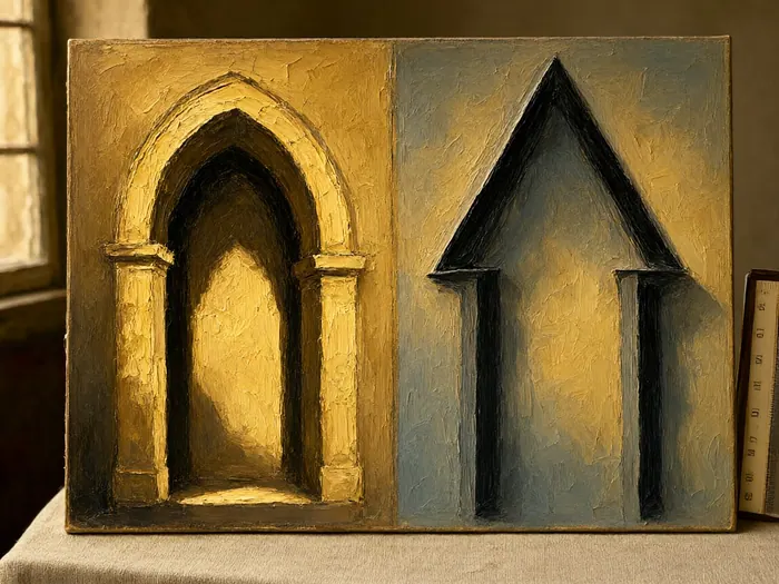
The arch family m, n, and r is three understrokes in a row, and it is where spacing usually falls apart, so leave a hairline's width of air between each stem, roughly one-tenth of an inch at this size. Then finish with the angled letters v, w, x, y, and z, plus e and s, which are ovals left open at the top or side instead of closed. By the end of week six you should be able to write all 26 lowercase forms, even if a half-dozen still need a slower, steadier hand and a second dip.
 Howcompass
Check Spacing and Slant With a Ruler
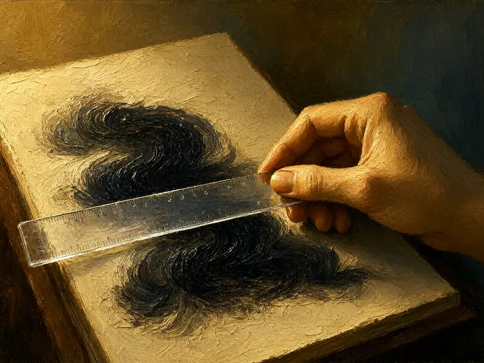
Write the word minimum twice, then lay a straight edge across the stems. Equal gaps read as good spacing even when the letterforms are still shaky, and unequal gaps are the fastest way to catch a drifting slant. Hold a 55-degree slant guide over the page and count how many downstrokes actually match it; if most miss in the same direction, rotate your paper another 10 to 15 degrees and retest, since slant drift is usually arm geometry rather than willpower. For a reusable grid, Tombow USA makes fine-line pens and mechanical pencils that draw guide lines you can work under tracing paper.
 Howcompass
Practice With Short Daily Drills Not Marathons
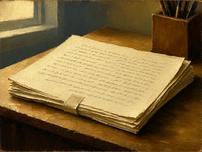
Twenty to 30 minutes a day, five or six days a week, beats a three-hour Saturday, because fine pressure control consolidates between sessions rather than inside one long sitting. Structure every session the same way: five minutes of building strokes, 10 minutes on your two weakest letters, 10 minutes on a real word, and three minutes writing anything you enjoy so the last thing you feel is progress. Date and keep every sheet, because your eye adapts to gradual change and only dated paper shows how far you have come. The habit shape in Start a Daily Gesture Drawing Practice transfers directly: short, timed, same slot, always saved.
Weeks 7-8: Move to Cards, Envelopes, and Tool Care
 Howcompass
Choose Paper That Lets the Nib Glide
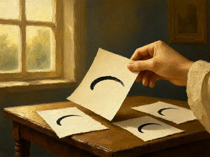
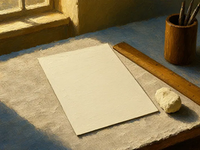
Pointed nibs snag on toothy paper, so test before you commit to a format. Plain 24-pound copy paper is the cheapest fair copy at $6 to $9 a ream and gives clean hairlines, while smooth 32-pound bond at roughly $8 to $14 for 100 sheets and marker pads add body without drag, which is what you want on a finished card. Avoid heavily textured cotton or cold-press surfaces until your control is solid, because that tooth is exactly what Paint with Watercolors wants and a flexed nib does not. Cut each candidate into a 3-by-5-inch test card and write the same ten letters on every one before deciding.
 Howcompass
Plan the Layout in Pencil Before Ink
Mark a light baseline and one or two slant lines with an HB or 2H pencil and a ruler, then judge the whole composition from arm's length before ink touches the sheet. Keep your writing inside a comfortable arc, which for a standard envelope means leaving about 1 inch of air at the right edge and starting the block a little above the horizontal center. Erase pencil guides only after the ink is fully dry, and lift with a kneaded eraser rather than rubbing, because a rubbed eraser drags a hairline straight off the page. Photograph the layout you like so you can repeat it without redesigning it each time.
 Howcompass
Address an Envelope Without Ruining Ten Others
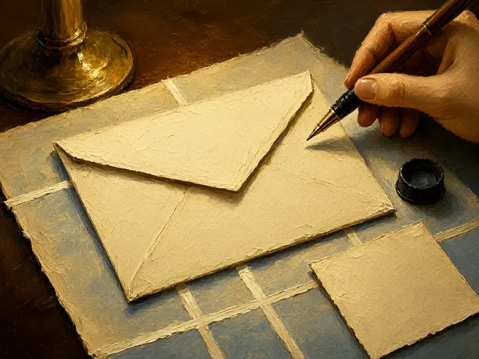
Work directly on top of your taped guide sheet, and rehearse the whole address once on a scrap of the identical paper so you feel the same drag before committing. Plan for three or four words at about 1/4-inch x-height on a standard 10-by-3-inch envelope, and stop writing rather than squeezing a long surname into the final inch. Keep it restrained: swells only on downstrokes, minimal linking between words, and no flourishes until the plain version looks right three times in a row. If the envelope is headed into a holiday mailing, our guide to Write Warm Annual Holiday Letters covers what belongs inside.
 Howcompass
Clean Nibs and Store Ink so Both Last
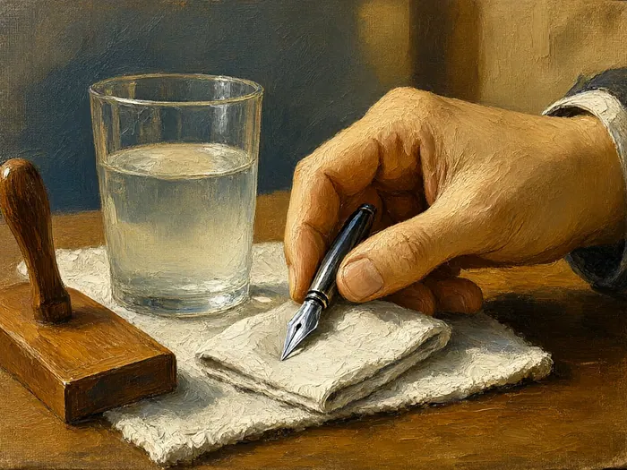
Rinse the nib in a cup of cool water at the end of every session, blot it dry, and never leave it wet, because standing water is what rusts even stainless steel. Wipe the flange and the tip of the holder too: a film of dried ink there changes the nib's angle by a fraction of a millimeter, and you will feel it as scratchiness the next day. Keep bottle ink covered, decant only what you need for a few days, and throw out walnut ink that grows a skin or smells sour. Expect a Nikko G to give 8 to 20 hours of practice before its tips splay and start splitting hairlines.
 Howcompass
Finish One Small Piece Every Two Weeks
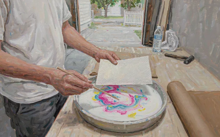
Technique sticks when it produces something you want to keep, so every second week spend 45 minutes on one finished job: a name card, a set of four place cards, or a single addressed envelope. Rule the guides, write it twice on the same stock, then critique the winner for matching slant, even swells, and hairlines that stay thin, and file the pieces you are proud of somewhere you will look at them. Comparing your work with historical hands in museum collections such as the Victoria and Albert Museum shows what consistency looks like at close range. Once your lettering is dependable, a decorated backing sheet makes a good gift base, and our guide to Make Marbled Paper With Shaving Foam and Acrylic Ink Drops shows one easy way to prepare it.
How to know it worked
- Hairlines stay thin and unbroken on upstrokes while downstrokes swell evenly in the middle of the stroke.
- Every lowercase letter sits inside the same 1/8-inch band, with ascenders and descenders filling their own zones rather than crowding.
- A straight edge laid across a word shows matching slant on at least nine of ten downstrokes.
- The gaps between stems look equal, so the word reads as spacing rather than a row of separate letters.
- One finished card or envelope survives erasing and handling with no blobs, no feathering, and no nib snags.
Common mistakes to avoid
- Buying a decorative quill or rigid fountain-pen set instead of a flexible pointed nib, then blaming the hand for a tool that cannot swell.
- Pressing on the upstroke, which spreads the tines the wrong way, splatters ink, and destroys hairlines.
- Overfilling the nib, so the first letter of every line is a blob and you cannot see what the tines are doing.
- Practicing freehand with no taped guidelines, which produces drifting letter sizes and slants that never look finished even after months.
- Writing on toothy cotton or cold-press paper and calling the nib defective when it is only catching fibers.
Frequently Asked Questions
Question: Do I need an oblique holder to start modern calligraphy?
No. An oblique holder makes the steep slant and open nib angle easier for most right-handed writers, which is why teachers recommend it, but a $10 straight holder produces the same strokes if you rotate the paper 10 to 15 degrees more than feels natural. Left-handed writers usually get cleaner results on a straight holder with the page turned toward them. Buy one of each if your budget allows $25.
Question: Should a beginner use a Nikko G or a Zebra G?
Either one, and ideally both. The Nikko G is slightly stiffer and springs back reliably under uneven pressure, which makes it the usual first nib, while the Zebra G is a touch softer and writes a little wetter. Both cost roughly $2.50 to $4 and fit the same holder, so a mixed ten-pack settles the question in one session. Switch only after wearing out two or three of the first.
Question: How long before my lettering looks good?
With 20 to 30 minutes a day, expect even shaded strokes inside three to four weeks, all 26 lowercase letters by week six, and a presentable short phrase on an envelope by week eight. Consistency keeps improving for another three to six months. Skipping the guide lines is the usual reason people stall, because the frame does most of the work of making handwriting read as lettering.
Question: Can I practice with a brush pen instead?
For pressure discipline, yes; for the same hand, no. A flexible brush pen teaches shading on downstrokes without ink or cleaning, and it makes a good warm-up, but the bristle bends as one bundle, so tine control, nib angle, and ink loading stay untrained. Pointed-pen tapers are also crisper. Budget for a real nib by week two if your goal is addressed envelopes.
Question: Why does my ink feather or bleed?
Feathering means the paper is too absorbent for a wet nib: soft copy paper, tissue-weight card, and cotton stock pull ink sideways out of a hairline. Move to smooth 32-pound bond, marker paper, or a coated card and retest. Thinning dense sumi with one or two drops of distilled water also reduces feathering, and an overfull nib makes any marginal sheet look worse.
Question: Which ink is safe for mailed envelopes?
Carbon-based sumi ink dries dark and water-resistant enough for postal handling. Walnut ink is a dye ink: it is lovely on a card that stays indoors, but it can lift with moisture and fade in strong sunlight over the years. For anything being mailed, sealed, or handled by other people, write one test envelope and let it dry overnight before doing the rest of the batch.
Question: My hand cramps after ten minutes. What am I doing wrong?
Usually three things at once: a white-knuckle grip, a pen held too upright, and strokes worked from the fingers instead of the shoulder. Loosen until the holder could nearly slide out, lower the shaft to about 40 degrees, and let long strokes come from the arm while the fingers handle only hairline joins. Rest and shake out the hand every 15 minutes, and see a clinician if pain persists.
Tips
- Buy nibs in a ten-pack and rotate three at a time, because a fresh nib in the middle of a session is what makes a bad day look fixable.
- Write your own name 20 times before anything else: it is the one word you will be asked for, and repeating a fixed string exposes spacing errors fast.
- Keep two cups on the desk, one for rinsing nibs and one for clean water, so dirty rinse water does not leave ink drying in the holder's flange.
- Put a thin sheet of scrap paper under your working page; it cushions the nib just enough to stop sharp tines catching on a hard tabletop.
- Photograph each sheet in the same flat light and the same position, because comparing photos at arm's length shows slant drift your eye misses on the page.
Warnings
- Metal nibs have sharp tine tips and can flick ink across the room. Never run a nib across your fingernail to test it, and keep the working end away from eyes and clothing.
- Rusty or splayed nibs tear paper and can scratch skin. Discard a nib whose tips no longer meet evenly, or that shows orange rust after rinsing, instead of trying to bend it back.
- Walnut ink and many sumi inks stain skin, carpets, and unsealed wood permanently. Work over a tray, keep a damp cloth handy, and test any ink that will touch a mailed envelope.
- Stop and rest the hand if you feel tingling, numbness, or sharp pain in the wrist or fingers. Sustained fine pressure on a flexible nib can aggravate a tendon, and no lesson is worth two weeks of recovery.
Things You'll Need
- Nikko G nibs, ten-pack
- Zebra G nibs
- Oblique pen holder
- Straight wooden pen holder
- Bottled sumi ink
- Walnut ink or ink crystals
- Small glass ink caps
- Low-tack painter's tape
- Ruler and a 55-degree slant guide
- Smooth 32-pound bond paper
- Marker or layout paper pad
- Lint-free cotton cloths and a rinse cup
- Kneaded eraser and an HB pencil
- Blank envelopes and plain cards
Related Howcompass Guides


References (5)
- IAMPETH - International Association of Master Penmen, Engrossers and Teachers of HandwritingIAMPETH
- John Neal Bookseller: Calligraphy Nibs, Holders, and InksJohn Neal Bookseller
- Tombow USA: Calligraphy and Lettering ProductsTombow USA
- Pilot Pen Corporation of AmericaPilot Pen Corporation of America
- Victoria and Albert Museum collection of writing and decorative artsVictoria and Albert Museum
Further reading
- Copperplate scriptWikipedia
- Sumi inkWikipedia
Encyclopaedia entries are background, not evidence: no step below rests on one of these.
Sources are listed so you can read the underlying guidance yourself. Our editorial policy explains how guides are reviewed.
Did this article help you?
0 readers found this helpful — add your vote.
No comments yet — be the first to share your results.